30 May Simple – Yes! But Not Too Simple.
30 May 2023
By David Allen, Development for Conservation
I have four Development Audits in various phases of completion right now. My work seems to run like that – no Audits at all for six months and then four all on top of each other.
One of the things I look at during these audits is the organizational “landing page” – the page one goes to when we click on the “Donate” button.
Usually, I find unnecessary complexity. Want to give online now? Become a Member? Give $25? $50? Give Monthly? Volunteer? Leave the land trust in my will?
-it’s too much.
People visiting are overwhelmed. It’s not easy, so some say “screw it” and leave.
Regardless, for some reason, all four of these land trusts had much simpler landing pages.
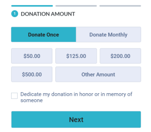
In this case, my giving options begin at $50 (which is OK), and Donate Once or Donate Monthly. The page defaults to Donate Once, but if one clicks on Donate Monthly, the dollar choices don’t change. (This was true for three of the four I studied).
$50 once? Or $50 every month forever?
Speed Date? Or Marriage?
Nothing in between?
My guess is that the page was developed by a software engineer who knows nothing about fundraising.
Where do I start? First, I would not recommend offering a monthly option on a generic landing page. The best time to solicit “recurring” donations (automatic withdrawals from a bank account or credit card) is right AFTER they have made a gift. Consider mailing a thank you, sending a newsletter, and then asking for a recurring gift – all in quick succession.
For people deciding to give, send them to a completely different landing page – one that starts at $5 a month and tops out at $50. Or offers quarterly options in addition to monthly. Consider that people simply wandering around on your website might not be able to navigate to this new landing page. It would have a separate URL.
Note that giving annually is not even an option. I wouldn’t necessarily recommend making another button labeled “Annual,” but why the implied promise of “Once”?
If we remove the button options from the landing page above, and replace the words “Donation Amount” with “I Love You Guys! And I Want to Help Now,” the rest works great.
And as you already know, I tend to favor the most basic premise of “membership.” That anyone giving any amount gets regular newsletter communication, invitations to special events, and an opportunity to renew 10 months later. I prefer the language of membership here, but I’m not wedded to it.
So if someone wants to give online, great. But let’s not dampen the expectation of an annual relationship by offering a Donate Once option.
Two of the four started the “Donate Once” ask string with $50. One started with $25, and one with $35.
Three offered four options with an “Other.” One had seven options. This last organization had offerings ranging from $25 to $2,000, and “Other” was positioned such that it represented “Less Than $25.”
I argue for simpler here. Presuming that people navigating to this page have never given before, make it appear easy and accessible. Personally, I like starting with $35, and offering just three or four options – perhaps ranging to just $250 or so.
If we follow the logic that simpler is better for our donation landing pages, we conclude that we will need multiple landing pages. Why send renewing $500 donors to a landing page that starts at $50?
But making them completely generic doesn’t work well either.
It’s just not that simple.
Cheers, and have a great week!
-da
PS: Your comments on these posts are welcomed and warmly requested. If you have not posted a comment before, or if you are using a new email address, please know that there may be a delay in seeing your posted comment. That’s my SPAM defense at work. I approve all comments as soon as I am able during the day.
Photo courtesy stocksnap.io


Carol Abrahamzon
Posted at 08:43h, 30 MayPerfect timing as we are currently reviewing and revamping our entire “Ways to Give” tab, thanks!